How we are building our latest B2B SaaS product and what you can learn from it
Learnings around design, differentiation, and building a B2B SaaS product from real hands-on experience.
Building a successful SaaS product is rarely as straightforward as following generic advice, that’s why I want to share with you my experience building our latest B2B SaaS product.
👋 Hey, it’s Daniela, welcome to our newsletter where we help marketers to move faster with the right, mindset, tools, and data. Here we share personal experiences and frameworks you can apply.
In this newsletter, I’ll cover:
How we learned of our first version of the product (MVP)
A prioritization method and how we rebuilt the product
Product principles that guided the design
The hot potato process for the ‘hand-off’ between product, design, and dev.
How we are using Figma as our single-source of truth
How a small team can build a great product fast
What are we measuring post-launch
Estimated reading time: 8-10 minutes
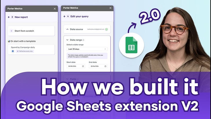
P.S. Watch the 9-minute YouTube video where I show you the documents we used, the product, and everything
I want to share the process of building -actually, rebuilding- our latest B2B SaaS product.
Context: we are building a Google Sheets add on, that allows you to import your marketing data from multiple channels to Google Sheets and refresh your data automatically.
Even if we have beautiful designed reports in Looker Studio the truth is that if you want to manipulate, combine, and control your data in an easy way, at the end of the day we always end up in a spreadsheet.
That’s why we built the Google Sheets extension, so you can setup your queries once and let them refresh everyday in your spreadsheet without having to copy-paste or waste time creating reports manually.
Learning of our mistakes and the first version of the product
We launched the first version, an MVP, about a year ago. Although we managed to get more than 13,000 downloads through SEO, our LinkedIn profiles, and our email list, the usage, activation, and monetization metrics weren't meeting our expectations.
The biggest learning here is that creating good things takes time, we wanted to launch fast but we needed to fix things from the integrations first, and build in modules so iterating the product is faster.
Some of the things we learned and what we did about it:
We needed to update our integrations so they are faster and accurate →, now we are migrating to a storage-first BigQuery system that works faster.
To help users to find value faster we needed to find a way to help them create queries without having to build them → we implemented templates based on customer use cases.
We identified that users need better feedback from the product → we designed specific error messages for the most common issues and we have an embedded chat were users can write us if something went wrong.
We identified that users want to export their tables horizontally to make comparisons → We introduced the orientation feature that allows users to change if a dimension or field will be exported as a column instead of a row.
We didn’t have usage and monetization feedback in the tool for the first version (basically we had the idea, and the design, but it never got implemented) → We included visual cues for the users so they know if their trial expired or if they don’t have available accounts.
How we prioritized the right things to build
First, we gathered feedback from customers and documented use cases from the first version of the product. We reverse-engineered the necessary features to solve these use cases.
Next, we prioritized the features in collaboration with the product manager and developer to define the scope for the new version. We balanced the priorities based on learnings from the first launch.
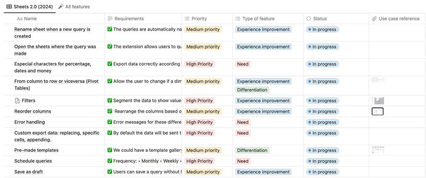
We categorized the prioritized features as high, medium, or low priority. We also classified them as experience improvements, needs, or differentiators.
This helped us A LOT, because we defined that we wanted to rebuild this in 2 months, and when you have time and resources constraints you have to be very good at prioritizing.
Also, having the team involved from the beginning during user discovery, feature prioritization, and the first draft, helped us to be aligned from the start and have a shared understanding of customer needs.
In my experience when the teams work in silos the team feels disconnected and the execution feels cumbersome.
The best teams I have worked with have high ownership, they care about customers, and they see their work as a craft.
You can see the features we prioritized for this new version:
Clear product principles
When thinking about how to build the product and design I needed principles to guide the process:
1. One important thing at a time:
Also known as Keep It Simple, Stupid (KISS).
We broke down the process into clear, distinct steps that the user could tackle one by one so they don’t get lost.
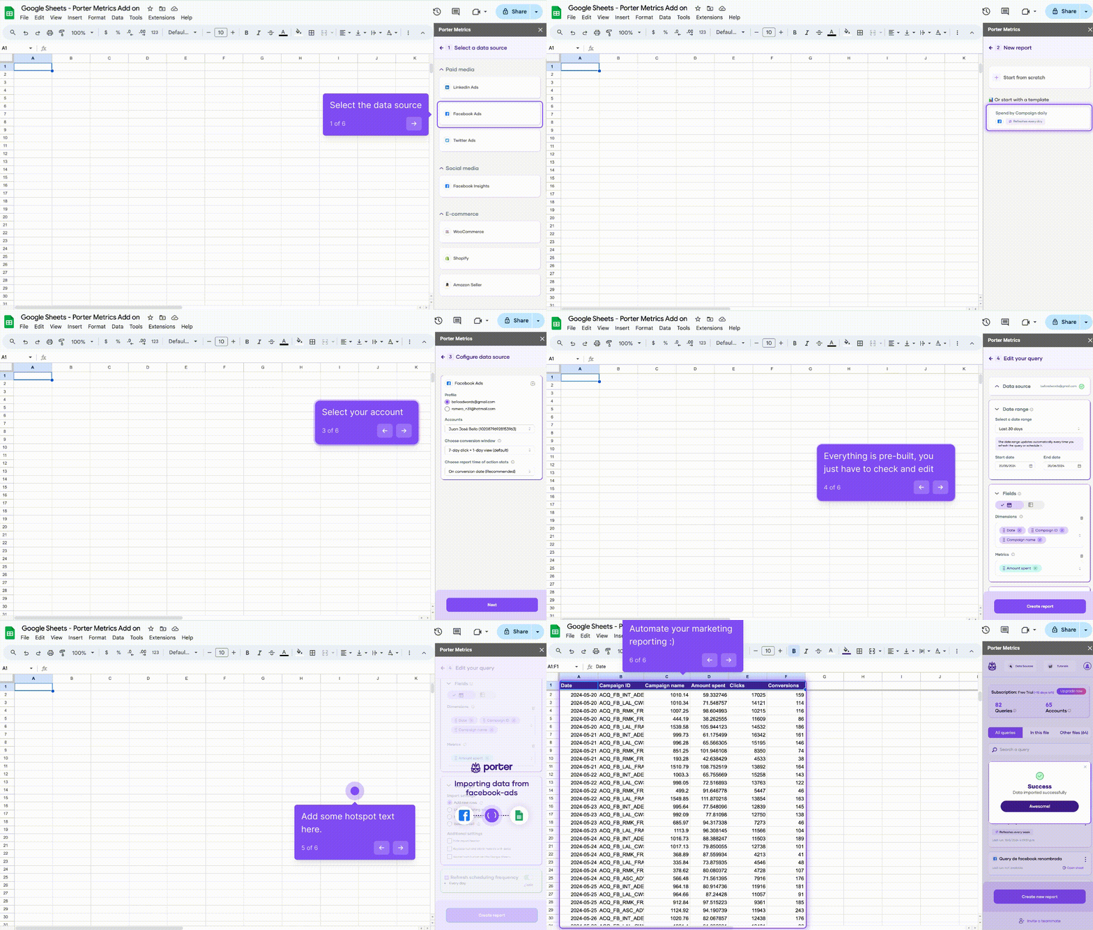
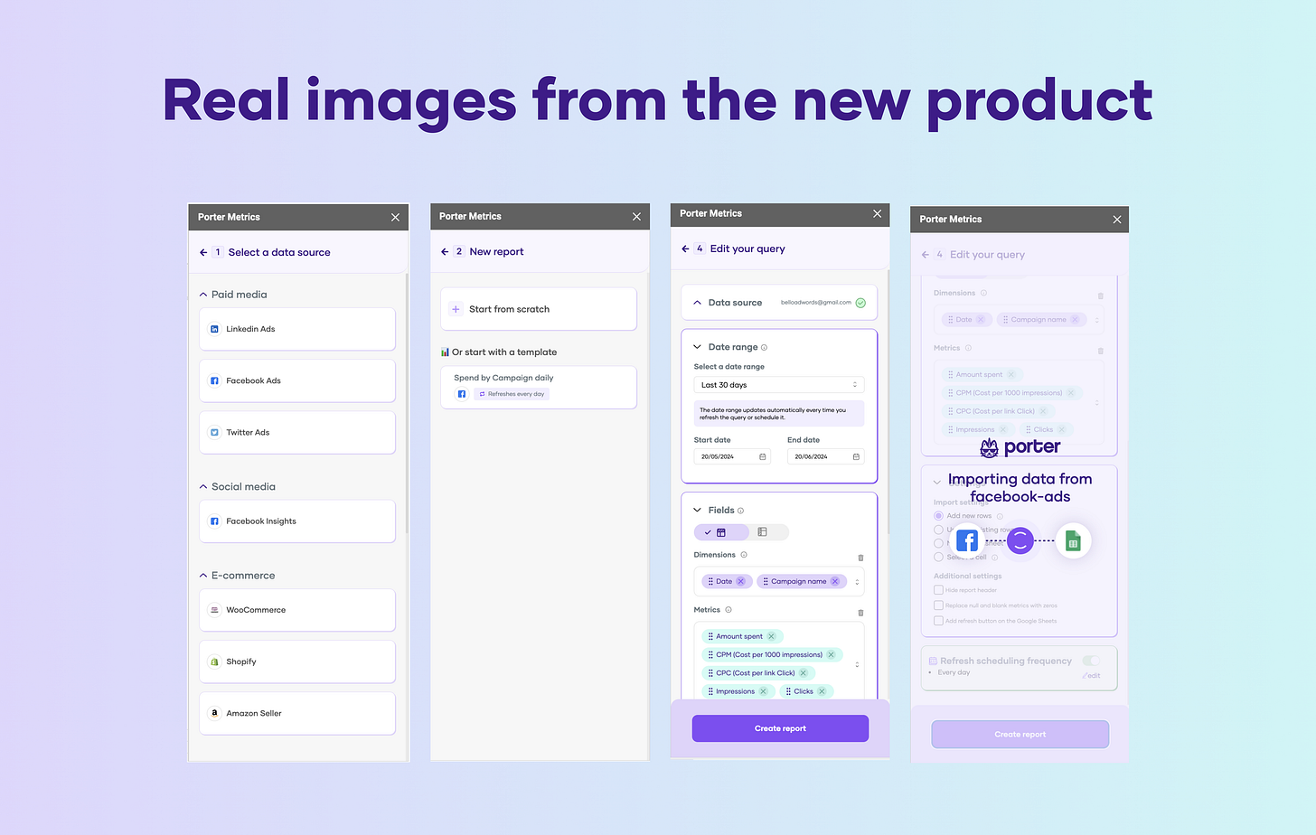
For instance: 1) Select the platform 2) Authorize permissions 3) Select the account 4) Create the query.
Each step is individual and the user can’t go to the next action without completing the previous one.
P.S. If we have multiple alternatives we try to make them obvious.
2. Beautiful and fun design
Using the product should feel like when you go to a beautiful place, feel good about it, and want to share it with your friends.
Data is full of boring, hard-to-use undifferentiated products, we want to change that (literally our brand is a cart unicorn)
Literally since we redesigned our admin we have received comments thanking us because it’s beautiful and easy to use.
3. Eliminating brain load by prefilling alternatives and adding shortcuts:
We prefill all the things we can, for instance:
The data source settings (things like conversion window).
If a user has only one account, it’s automatically selected.
Settings like date range or filters guide the user.
Also, we offer templates during the query creation process that will reduce the building time by 80%.
Users can edit them to have new queries running in seconds, and now they know what success looks like.
Product, design, and dev: The best hand-off is no hand-off
A few months ago I read something that really stuck with me: the ‘Hot potato process’ where product, design and developers work together and they go back and forth throughout the product creation cycle to create better products and move faster.
From early on, we embraced this approach by having weekly 30-60 minute touch points with a small team of only three people. This group was small enough to move quickly, yet big enough to make informed decisions about the product.
This methodology helped us see progress, answer questions, and catch and address issues early on, rather than waiting until the end of a siloed process to discover problems.
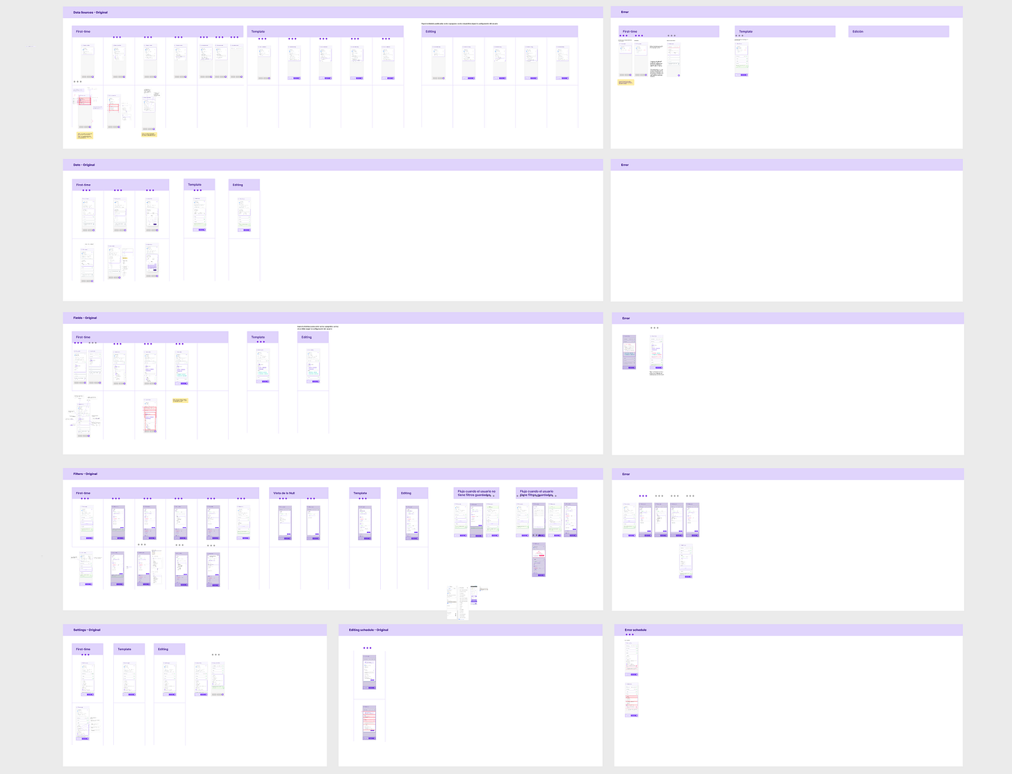
Our single source of truth: our Figma file
We maintained a master Figma file that served as the single source of truth for our product's design.
This file contained all the screens, user flows, and design specifications needed for development. Any changes or updates to the design were made directly in this master file, ensuring that everyone always had access to the latest version.
Everything was cool until it wasn’t:
We reached a point were we had over 100 screens, and we made a lot of iterations based on the feedback we received. It felt like we were losing control of the frames because it was very hard to keep up the changes on every screen and variation.
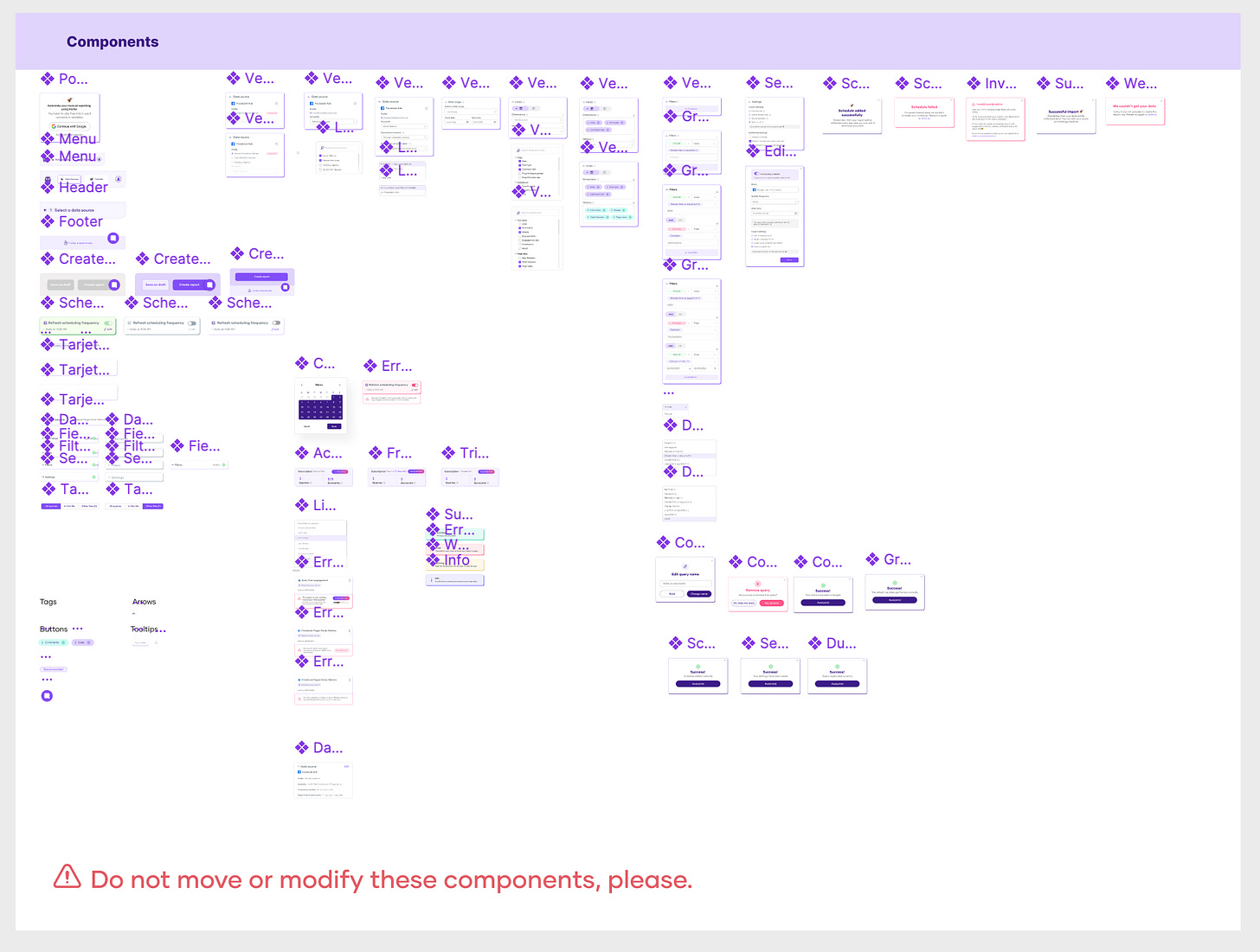
That’s why we made a strategic decision to shift our approach and build everything using components.
Instead of treating each screen as a separate entity, we started thinking in terms of reusable components that could be mixed and matched across different parts of the user journey. This component-based approach allowed us to maintain consistency, reusability, and organization throughout the design process.
Then, as we mapped out the different stages of the user journey, we started plugging in those components where they made sense. It was like building with blocks - we could quickly swap out components, make tweaks, and see how everything flowed together.
Now I’m a fan of components and wouldn’t do it any other way :) If you have this problem with your design systems, maybe this can shed some light for you.
Small teams can build great products
The team that was involved during the creation process were only six people in total and they weren't working on the product at the same time.
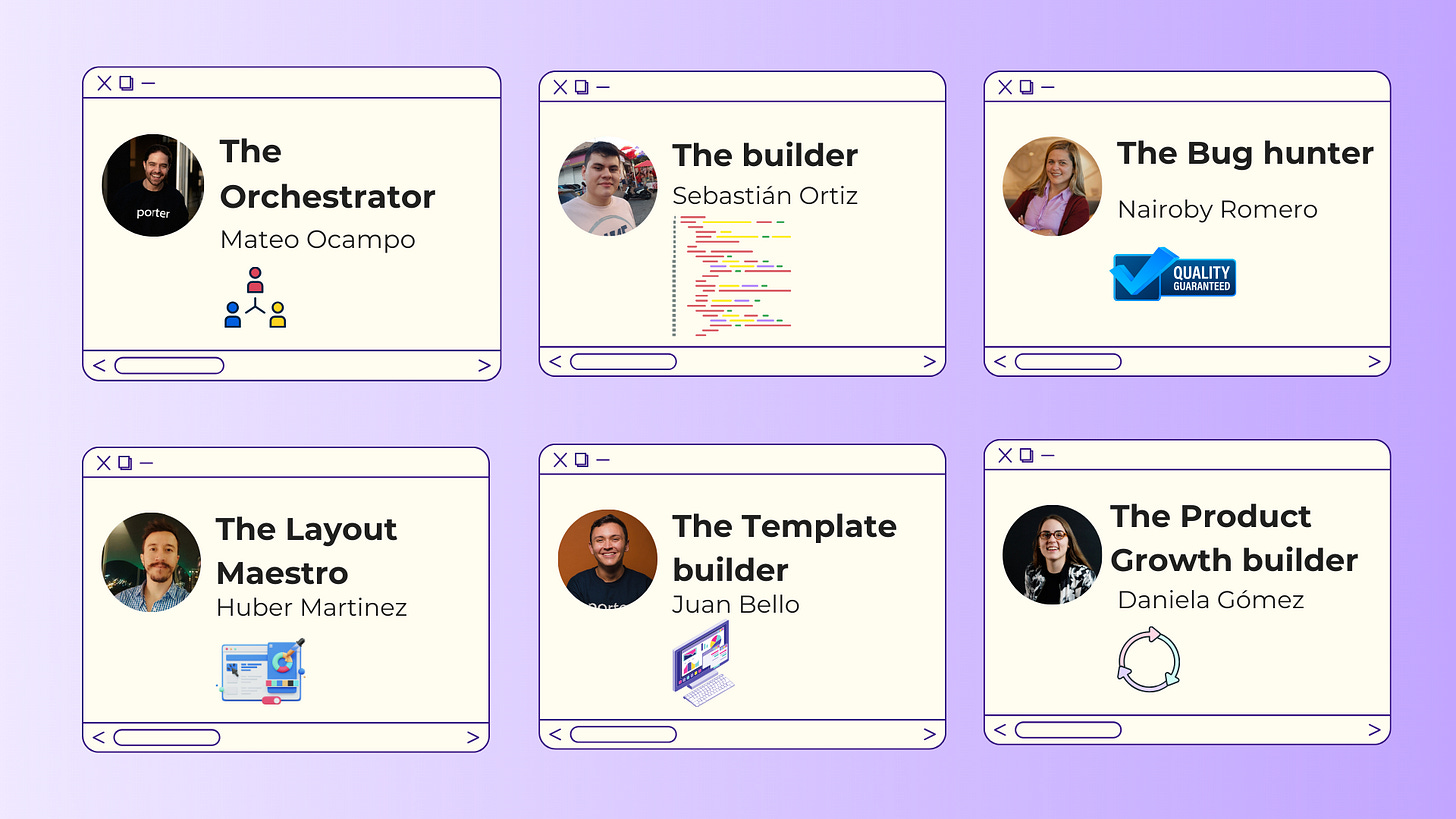
We were only three people working actively during the whole process:
A growth product manager (me): Defining the user journey, the features, and how the product should behave. - Daniela
UX/UI designer (not in-house): Designing and creating all the wireframes and design system in Figma. - Huber
Senior full-stack developer (in-house): Building the frontend and backend, and making suggestions to improve the product. -Sebastián
And three additional team members that contributed during the process:
Product manager and co-founder: Served as as a bridge to prioritize and help the developer with any blockers in the day-to-day work. - Mateo
QA: Tested the tool and detecting any bugs, unexpected behaviors and identified improvement opportunities. - Nairoby
Co-founder and marketer: Helped build the queries so we have templates by data source to reduce the time-to-value for users. - Juan
Launch, get feedback, and iterate
Now we are relaunching the product we are doubling down on SEO, LinkedIn, Youtube, and email so we get new users and existing customers to use the product.
What are we going to measure?
We try to simplify it to measure what matters so we are able to do things based on the data and information we have available
We have a complete article around how to analyze your marketing reports
Marketing:
New website users for Google Sheets pages (tutorials, product pages)
User to signup conversion rate (%)
Product:
Extension Installs (new users)
CR (%) install to trial started
Trials started (activation) → measured when someone creates their first successful query
CR (%) trial started to new customers
New customers → users or teams who bought a subscription
Queries run broken down by user state (trial, customer) → to measure engagement
Qualitative feedback:
We will try to get feedback from past users so we understand if with all the improvements we fill their expectations and solve their use cases.
Questions around usability or features
Identify bugs or unexpected product behaviors that may be damaging the user experience
New use cases or needs from our target customers: small and medium marketing teams and agencies.

